Wednesday, 29 October 2014

Week 5: ORC Pulling It Together

Thanks for stopping back by for week 5 of the One Room Challenge.  If this is your first visit, you can catch up on the progress here:


This week, I  narrowed down the bed linens for the bunk beds.  I selected the West Elm Ticking Stripe Duvet .  Though the beds are full size, I ordered the duvet covers in twin size because I didn't want to much cover hanging over the bed.  It turns out, it still provides great surface cover and the kids won't have to constantly worry about tucking the overage into the mattress. 


You know how much I like to mix patterns so I went with the West Elm Dot Sheet set in guava (full size sheets).  I decided to use orange as the accent color in the room so these are perfect. 

Next, I'm looking for something to go under the window.  The room has a bit of a bump out that is perfect for a small sitting area.  I'd love to find something masculine like this little storage ottoman. 

Courtesy of Pinterest

And.....the wallpaper is up!  I am thrilled with the results.  Here's a bit of a sneak peek. 


Next, I've got to pull all of the details together. It would be great if I could accomplish the following:

  • Window Ottoman
  • Throw Pillows for bed and ottoman
  • dresser or shelf for storage
  • Curtains or pulls on the windows
  • Accents on the art table
  • Decide where to put the buoys from Brimfield
What do you think so far? 

Check out the other makeovers on Calling It Home


Wednesday, 22 October 2014

Week 4: ORC Ceiling Reveal!

 
It's hard to believe that this is week 4 of the 6 week One Room Challenge.  For those of you that are freshly visiting, the ORC is a makeover challenge where designers select one room to design over the course of six weeks.  Each week, progress is revealed.  If you need a refresher on what's happened so far during my son's bedroom makeover, please visit the previous weeks: 
 
 
Now, there's been a lot of speculation about what I would do to the ceiling of this bedroom.  I had considered painting but ultimately, I decided to wallpaper the ceiling.  I wanted a rustic and boyish look that was cool but would also grow as my seven year old gets older. 
 
The selection:  Thibaut Rodanthe in Grey !  I love the appearance of wood planks and I think it's going to look stunning up on the ceiling. 


I've decided to do the horizontal walls in the bedroom in the Vintage Global Map Custom Wallpaper from Design Your Wall.  Together, I think the two papers give a great contrast. 


The wall is prepped for the paper in this photo:

 
As I mentioned in week 1, I wanted individual lighting on each bunk level so that the kids could have extra light when reading in bed.  I found very industrial looking lights at Restoration Hardware Gallery,  The Factory Cage Sconce
 
 
Here are the factory cage sconces installed in the room before the wallpaper is added. 
 
 
Normally I'm a total color gal, but I'm trying to stay neutral in this room with a few subtle pops.  I purchased the Target Threshold Criss Cross rug for the room to add extra pattern and texture. 


Here's a small glimpse in the room:

 
Also, on my last trip to Brimfield, I spotted these buoys.  I wasn't sure how to use them but I thought they could be incorporated into the room somehow so I bought a handful of them.  They're so colorful and add a vintage look to them. 
 

 And...I need some window coverings to replace the temporary shades that have been up in the room for the last 2 years....how's that for TEMPORARY!  This is a stripe from Calico and I think it may be just enough contrast on the windows without being overkill...


So, it's coming together slowly but surely!  Two more weeks until the final reveal!  What are your thoughts about the Thibaut Rodanthe paper for the ceiling!? 

Check out some of the other talented designers in the challenge.  Visit Calling It Home to see the progress! 

Cheers!

Heather


Wednesday, 15 October 2014

Week 3: ORC: DIY Boy's Room w/ Seating, Ceiling, Lighting and Walls!


Thank you for checking back on my progress in Week 3 for the One Room Challenge .

I'm updating my son Jack's room.  If this is your first visit here, you can catch up here:

Week 1: The Plan  |  Week 2: Bunk Bed Selection


I never know how to gauge the momentum of this challenge.  I always start out slowly and then panic around week 3 when I realize how much there really is left to accomplish.  To say I kicked it into over drive this week is an understatement! 

I selected the bunk beds for the room.  I wanted a sturdy and hearty look in this room.  I selected the Restoration Hardware Child & Baby Callum Platform Full over Full Bunk Bed in the Sandwashed Grey color. And here is how the bed's look installed in the room. 


I love the beds.  The full sized mattresses are terrific!  But there's still so much left to do!  I pulled up this little table from our basement because I think it may make a great little art table in the room for the kids.  I wanted to do smaller seating around the table and considered oversized bean bags. 
 

 Then, on a trip to ikea, I spotted these little basket weave rockers, the Ikea Rattan PS Gullholmen Rocking Chair.  I thought they'd add character around the table.  During the same trip, I found an adorable plaid throw blanket and global map pillow.  I decided to make a quick purchase decision and not brainstorm any longer about other potential seating. 


And, voila!  Here they are in the room.  (Ignore that fuchsia and purple striped ottoman in the background.  I originally had very different plans for a Hollywood Regency type room...but that was back when it was dedicated to be a guest bedroom).  I love these little rocker chairs in the room. 


I wanted something unique for the ceiling.  (I'm surprised by the overwhelmingly excited response to the painted circus top design from my inspiration photo!)   I think many may be disappointed to learn that, in the end, I decided that wallpapering the ceiling would be the way to go.  I wallpapered the guest bedroom ceiling and love the results.  (See here). 

Here's a photo where the wallpaper guy prepped the ceiling for paper....


Also, I found a terrific rope pendant from RH Baby & Child, the Rope Orb Pendant.
 
And lastly, I discovered this custom vintage global wallpaper from Design Your Wall called Sea Explorer.  I think this may provide just the amount of "boy" for the room that I'm looking for.   I would put this on the walls of the room and need to find a covering for the ceiling that would compliment it.  Next on the list,  new bedding, a rug and accent pieces to tie the room together!


I'm moving quickly into week 4 and am excited to share the updates with you next week. 

What do you envision for the ceiling to compliment the global wall paper on the side walls?  I've already made the selection and am anxious to reveal next week!

In the meantime, stop over the Calling It Home for the others' updates! 
Cheers

Heather

Thursday, 9 October 2014

ORC Week 2: Bunk Bed Selection

 We're entering week two of the One Room Challenge.  Check back here for Week 1. 

You may recall that the last time I participated in the ORC as a linking participant, I made over our guest bedroom.   Here's the bohemian chic guest bedroom reveal  (another post here) from the past challenge. 
This time, I'm making over my 7 year old son's room and have been on the hunt for a bunk bed that will grow with my son.  I don't want anything that is flimsy or temporary looking.  I noticed that many of the styles I'm drawn to are built in bunk beds.  Built into the walls of their environment.  Hmmm...well shoot, I wasn't planning on THAT endeavor. 

Here are some of my favorite beds located in my search:
Courtesy via Marcus Design
Via RH Gallery

Courtesy via Houzz.com
Rover Homes

 
Coastal Living via Babble

Yep, as I told you.  Most of these are built-in bunk beds that have been custom built into the room.  I wanted something that was grown up.  Not too childish.  A bit industrial. 

So my selection: 


The Restoration Gallery Baby and Child Bunk Bed! 


Via RH Gallery

Here's why:

Each mattress is full size rather than the standard twin size for a bunk bed.  I love the distressed wood and the sturdy look of these beds.  These are shown in the white but I'm ordering them in the darker wood.  This photo is a bit feminine for a little boy's room, but I have some ideas about how to make them more masculine. 

I'm still on the hunt for a way to make the ceiling stand out in a unique way. 

I'm fighting the urge not to paint the room in bright colors like the rest of my house.  My theme is neutral tone for this room!  Fight the color pop urge. 


Next step, figuring out the walls of the room.  That may help shape the rest of the décor.  For a better look at other rooms of my house, check here

Thanks so much to Linda from Calling It Home for allowing us Linking Participants to join in on the One Room Challenge. 


Here are some of the other

 
Here are individual links to each participant. 
 
Additionally, You can see more linking participants by visiting Calling it Home
 
Cheers!
Heather
 

Friday, 3 October 2014

Autumn Blog Hop: Vivid Hue Fall Reveal


This has been an exciting week!  Yesterday kicked off another One Room Challenge and I'm crazy enough to participate again.  For a sneak peek into the room I'll be making over, go here
 
And today, it's finally my turn to partake in the Autumn Blog Hop!  Over the course of the last 7 days, 6 other bloggers have participated in The Pink Clutch's Autumn Blog hop.  To see their fabulous reveals, visit here and here
 
Today, I'm sharing 5 key elements that I like to use when decorating my home for fall. 


1. Feathers

I use feathers in my arrangements because they introduce an unexpected element.  I've been known to add them to flower arrangements, centerpieces, napkin ring holders, wreaths, my children's hair (ok, teasing about that but just making sure you're still reading).  Years ago, I paid a small fortune at an antique store for pheasant feathers.  (I guess the dust on them qualified them as "vintage").  But these days, I hit the craft store and buy them for dirt cheap.  
 
Here are some scenarios where I am currently using the feathers. 


2. Unconventional Color Use

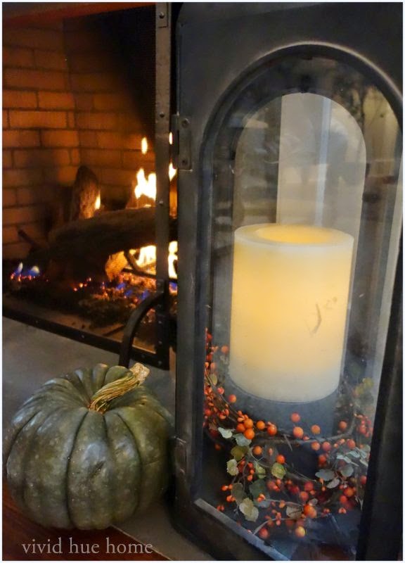
Ya'll know I love color, thus the name Vivid Hue (bright colors).  And I'm all about creating an unexpected element in home décor.  For example, during the Christmas Holidays, I don't use the conventional red and green but rather an eggplant.  And the fall season is no different.  I try not to stick to the expected orange and brown hues when decorating for fall.  I love white pumpkins and sage colored gourds.  This season, I even pushed the limit a bit and used celadon green on a table setting.  I mixed pears with white pumpkins and feathers and acorns. 
 
Hattan Home sent me their Chinoiserie Placemat in Lime Citron to try out.  I added the placemats right into the mix (love the chinoiserie print on these paper mats).  Now, granted, the salmon color in my table runner and napkins was making this a bit more spring-like than even I'm usually comfortable with.  But my point is, have fun with colors and don't restrict yourself to typical seasonal choices. 


3. Gourds and Indian Corn

Yes, these are an autumn staple.  I do feel like a bowl of gourds are a must have for a fall home.  This year, I found blue corn and used them with my dusty blue placemats.  So, despite what I said above about avoiding the traditional orange and brown fall colors...I do use them in small doses. 


This photo is NOT from my home but I wanted to share because I absolutely love the candle wrap they created from this.  If I can get my act together, I hope to try this before Thanksgiving comes and goes.  (And I'll post an updated picture here).  In the meantime, my apologies for not knowing who to credit this photo back to.  (Sloppy). 


 4. Halloween Décor

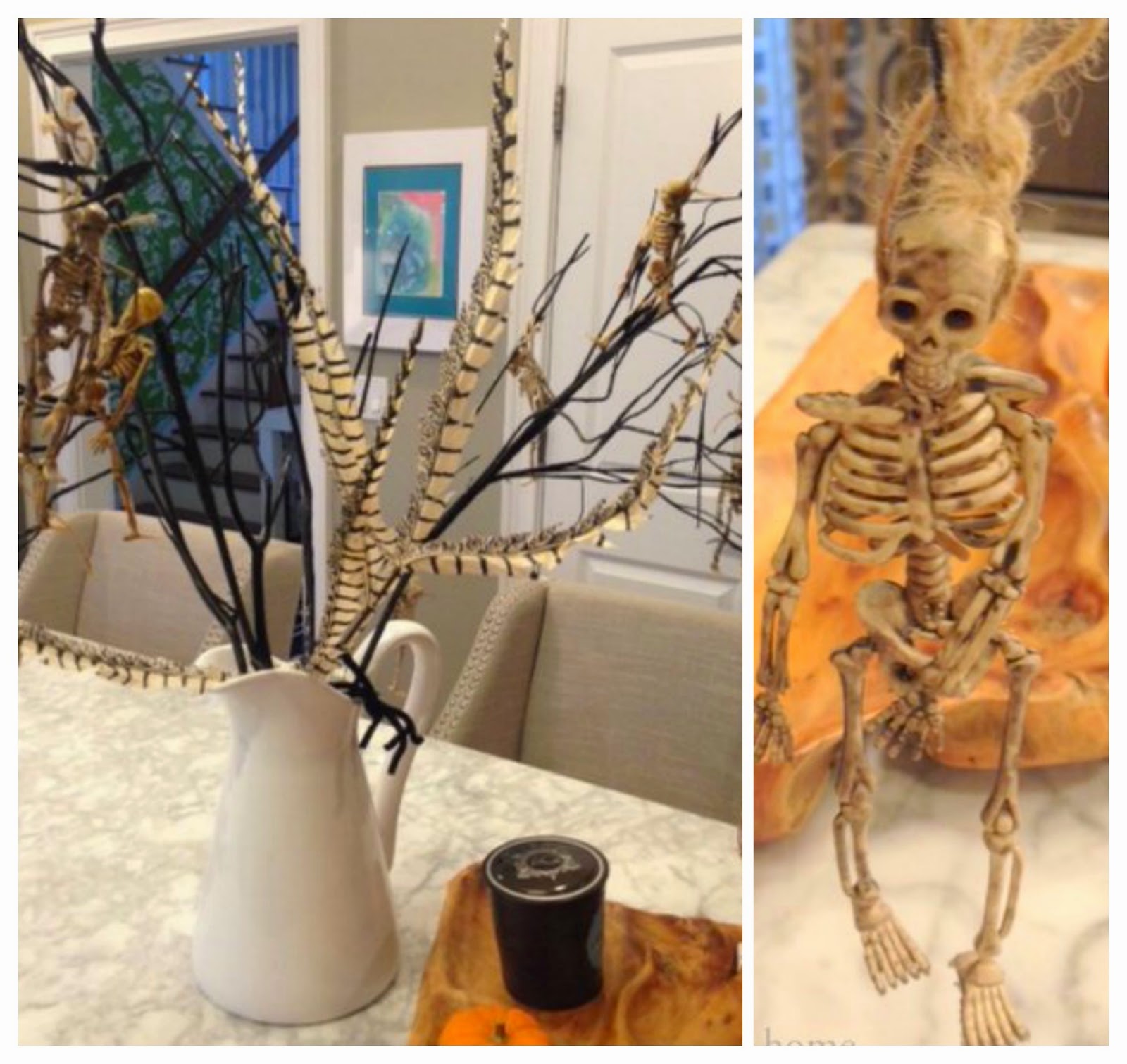
Tis the season.  You can't think of fall without considering Halloween.  We definitely find ways to enjoy the Halloween season.  We put up a spooky tree with black branches and skeletons.  We hang tacky black garland around our kitchen light.  We even garnish the outside of the house with oversized black furry spiders.  (And we got a jumping spider this year to scare all of the neighborhood kids).  Ah... yes, when you have a 6 and 7 year old, these little things are essential. 


Full disclosure, this is another photo that I borrowed from the web.  This is not my house, though I'd love to do this.  If I can get my act together.  And if we can finish off 30 plastic cartons full of milk.  STAT. 
 
 
 Now, this lovely display *is* proudly being displayed in our home.  My husband is a complete freak...er Star Wars freak and loves anything and everything having to do with Star Wars.  These were the last 2 lanterns left in CVS today so I grabbed them.  He's sort of a decoration hoarder when he spots something he loves, so I would not be surprised if I catch him driving to every CVS across Connecticut looking for more of these sucker.  You know, one can never have too many fake black plastic Star Wars pumpkins....
 

5.  Fall Planters

And ending on a classy note, planters adorned with fall flowers and plants are a great fall staple.  I have never even attempted to act like I have a green thumb of any sort.  I have my wildly creative friend Jen from @thymetoplant refill these babies for me each season!  (Local Connecticut peeps can visit her here). 


Lastly, be sure to check out all of the talented designers that are busily working away on their home makeovers for the One Room Challenge.  You can see hundreds of transformations on the Calling It Home site (Linda is the mastermind and creator of this entire challenge). 
 
Also, visit more of my home here.    
 
Happy Fall!
 
Cheers,
Heather

 
PS- Thank you to Hattan Home for sending me their Chinoiserie Placemats.  I was not endorsed in any way for the use or review of this product. 


Related Posts Plugin for WordPress, Blogger...