


The inspiration for my living room started with the Antoinette Wysocki oil painting above my fireplace. We were still in the planning stages for building our new house and this was a gift from my husband for Christmas. It was my first real piece of art and I loved it. The cranberry red hues in the painting were inspiration for the tufted ottoman and Benjamin Moore Classic Burgundy accent wall.

The room was rather large with two potential focal points: the fireplace and the flat screen tv (I begged my husband to conceal this behind a built in wall cabinet, but you see who prevailed). We created two sitting areas in the room, defined by separate ottomans and sitting areas.

The area by the fireplace has two Hounds tooth Clayton Chairs. The plaid ottoman (Jacobean Demi-Lune) reminds me of a cozy wool coat. The red is a subtle continuation of the cranberry color. When we have extra guests, this can also serve as additional seating. (Thank you to Holly Russo at Lillian August for this plaid ottoman design).

Holly also helped us find the perfect entertainment cabinet for the room. It has a brushed sand coloring that blends with the Benjamin Moore Sandy Hook Grey walls and it hides our entertainment items beautifully.

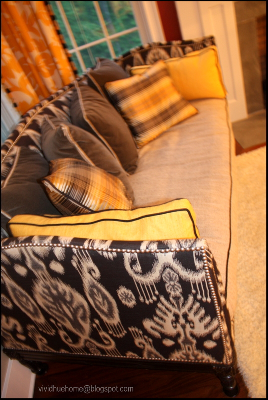
This Lillian August Belvedere is one of my favorite pieces. You can guess how much fun it was to mix multiple patterns and colors for this end result (I had help from Carolyn Wise at Lillian). The outer frame is covered with an ikat ebony and charcoal print. The down cushion is a flax linen with black piping. There are marigold side pillows with black contrast piping and gray velvet back pillows. The gold and black silk plaid pillows continue the same color hues.

The opposite side of the room is more subdued (for me, ha) with Lillian August Albert Sofa and Side chair in grey velvet. There is a Chrysanne wool round rug that defines this sitting area. The ottoman is a red tufted leather with pewter nail heads.


I am drawn to anything with Greek Key. I knew these grosgrain ribbon Greek key pillows would give a great accent.

This Per Se Round end table has a fabulous travertine top. It's an unexpected 'unfinished' look to keep the room from being too polished. The silver lamp is James Young and I was drawn to the over sized shade.

To keep it at the same eye level as the floor lamp on the other side of the couch, I added some of my favorite design books to add height. (Thank you Holly Russo for the suggestion).

Here's the view from the kitchen into the family room. They're really a continuation of each other so it was important to have the same feel in both rooms. The Benjamin Moore Sandy Hook Grey paint is carried into the kitchen. This is just a sneak peek of the kitchen view. Check back at a later date for a house tour of the kitchen. (PS- I couldn't resist this pendant from Restoration Hardware, even if it obscures the view of the tv slightly).


It's breath-taking).

We positioned the sofa a few feet from the back wall to create a hallway from the kitchen to the sunroom.

My stack of House Beautiful mags give the peonies some height. The photo on the back left is one of my favorites...a silhouette of my kids at the beach handing off a mini Star Wars light saber.


I bought this poster from Etsy.com and I always remember it as a quote from Strawberry Shortcake (of course now I can't authenticate that through google search). But anyway, to me, the use of the word "will" shows determination. I interpret in my own way to mean...if you work hard, love unconditionally, try to be a good person, put your family first, be kind, (you get the point) etc, etc then it's possible to have the best of both worlds.


Hope you enjoyed the family room tour*.
Check out other room tours here
Also, I have additional photos of this room on another post that can be viewed here.
Also, I have additional photos of this room on another post that can be viewed here.
*I must acknowledge that I had help from several Lillian August designers for the culmination of this room (Carolyn Wise | Holly Russo). My goal was to continually push the limit in how daring the design could go but many people contributed to the end result.


